1. Overview
- The template used to create a ggplot2 chart.
ggplot(data = <DATA>) +
  <GEOM_FUNCTION>(
     mapping = aes(<MAPPINGS>),
     stat = <STAT>,
     position = <POSITION>
  ) +
  <COORDINATE_FUNCTION> +
  <FACET_FUNCTION>
2. Comparison
2.1 Density (Numeric Distribution)
A density plot shows the distribution of a numeric variable.
# Make the histogram
 p1 <- diamonds %>%
  #filter( price<300 ) %>%
  ggplot() +
    geom_density(aes(x=price),
                 fill="#69b3a2",
                 color="#e9ecef",
                 alpha=0.8) +
    scale_x_continuous(limits = quantile(diamonds$price,c(0.01,0.99))) +
    geom_vline(aes(xintercept = mean(price)),
             linetype = "dashed", size = 0.6,
             color = "#FC4E07") +
    ggtitle("Diamonds price distribution")


 # Dummy data
data <- data.frame(
  var1 = rnorm(1000),
  var2 = rnorm(1000, mean=2)
)

# Chart
p2 <- ggplot(data, aes(x=x) ) +
  # Top
  geom_density( aes(x = var1, y = ..density..), fill="#69b3a2" ) +
  geom_label( aes(x=4.5, y=0.25, label="variable1"), color="#69b3a2") +
  # Bottom
  geom_density( aes(x = var2, y = -..density..), fill= "#404080") +
  geom_label( aes(x=4.5, y=-0.25, label="variable2"), color="#404080") +
  xlab("value of x")

# Chart
p3 <- ggplot(data, aes(x=x) ) +
  geom_histogram( aes(x = var1, y = ..density..), fill="#69b3a2" ) +
  geom_label( aes(x=4.5, y=0.25, label="variable1"), color="#69b3a2") +
  geom_histogram( aes(x = var2, y = -..density..), fill= "#404080") +
  geom_label( aes(x=4.5, y=-0.25, label="variable2"), color="#404080") +
  xlab("value of x")

grid.arrange(p1,p2,p3,nrow=3)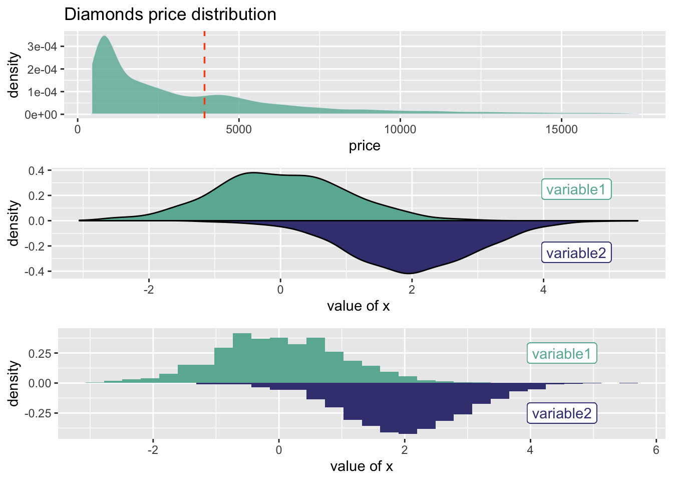
Compare desity by groups
p1 <- ggplot(data=diamonds, aes(x=price, group=cut, fill=cut)) +
    geom_density(adjust=1.5, alpha=.4)

p2 <- ggplot(data=diamonds, aes(x=price, group=cut, fill=cut)) +
    geom_density(adjust=1.5) +
    facet_wrap(~cut) +
    theme(
      legend.position="none",
      panel.spacing = unit(0.1, "lines"),
      axis.ticks.x=element_blank()
    )

# basic example
library(ggridges)
p3 <- ggplot(diamonds, aes(x = price, y = cut, fill = cut)) +
  geom_density_ridges() +
  theme_ridges() +
  theme(legend.position = "none")

grid.arrange(p1, # First row with one plot spaning over 2 columns
             arrangeGrob(p2, p3, ncol = 2), # Second row with 2 plots in 2 different columns
nrow = 2) 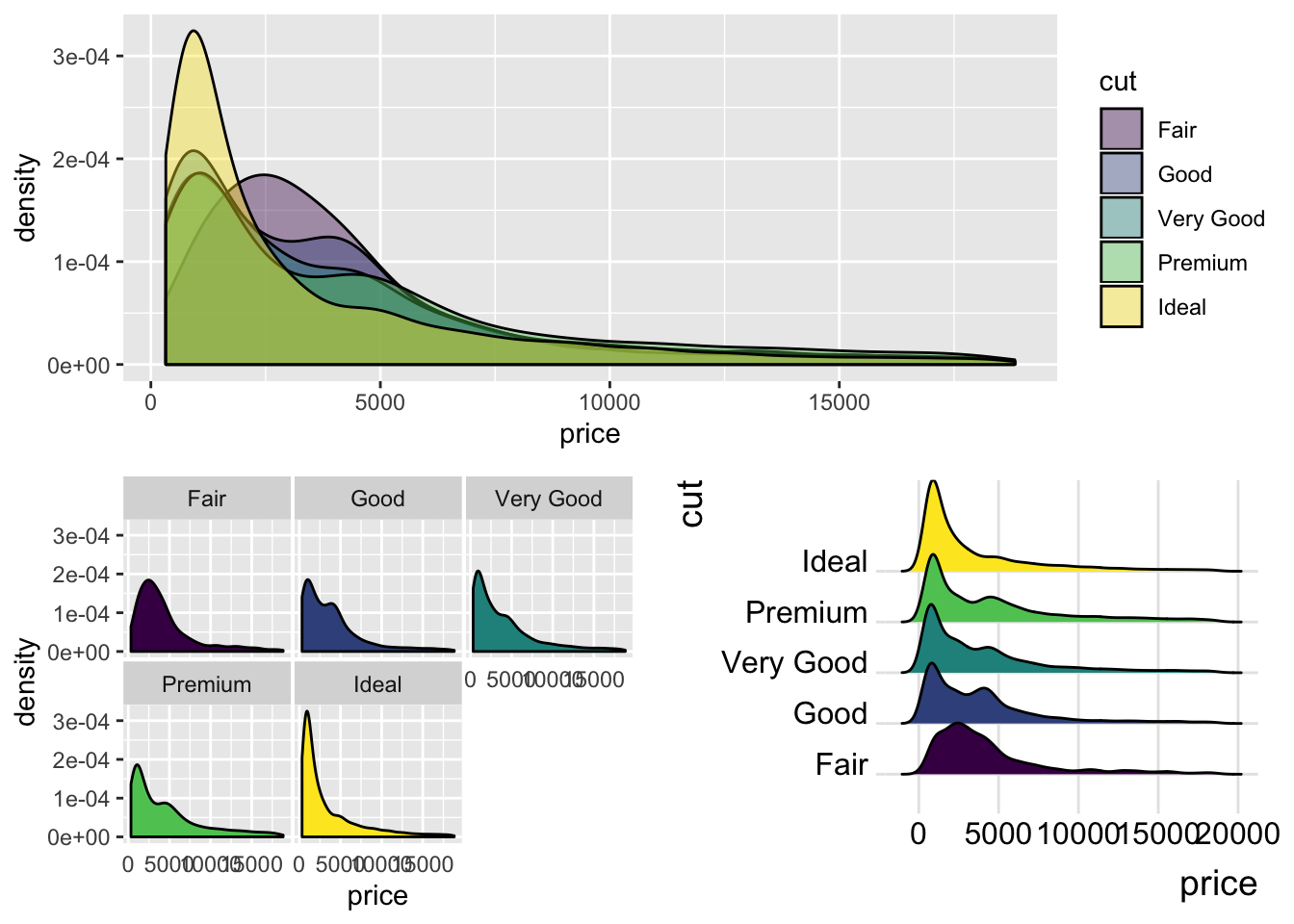
2.2 Boxplot (Numeric Distribution)
ggplot(mtcars, aes(x=as.factor(cyl), y=mpg)) +
    geom_boxplot(fill="slateblue", alpha=0.2,outlier.shape = NA) +
    scale_y_continuous(limits = quantile(mtcars$mpg,c(0.01,0.99))) +
    xlab("cyl")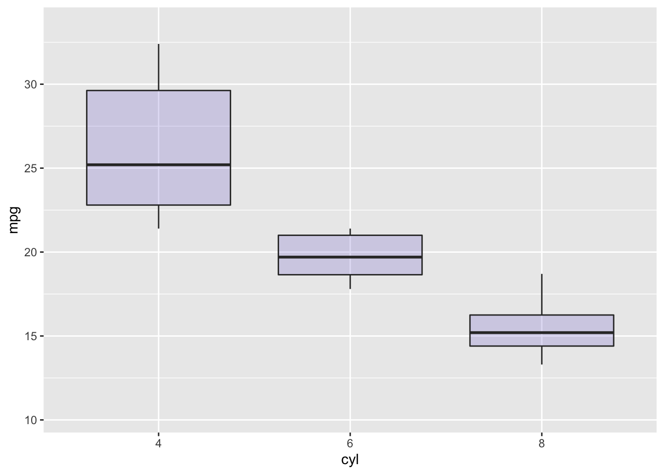
# create a data frame
variety=rep(LETTERS[1:7], each=40)
treatment=rep(c("high","low"),each=20)
note=seq(1:280)+sample(1:150, 280, replace=T)
data=data.frame(variety, treatment ,  note)

# grouped boxplot
p1 <- ggplot(data, aes(x=variety, y=note, fill=treatment)) +
    geom_boxplot()
ggplotly(p1) %>%layout(boxmode = "group")
p2 <- ggplot(data, aes(x=variety, y=note, fill=treatment)) +
geom_violin()
gridExtra::grid.arrange(p1,p2,nrow=2,top="2 boxplot charts")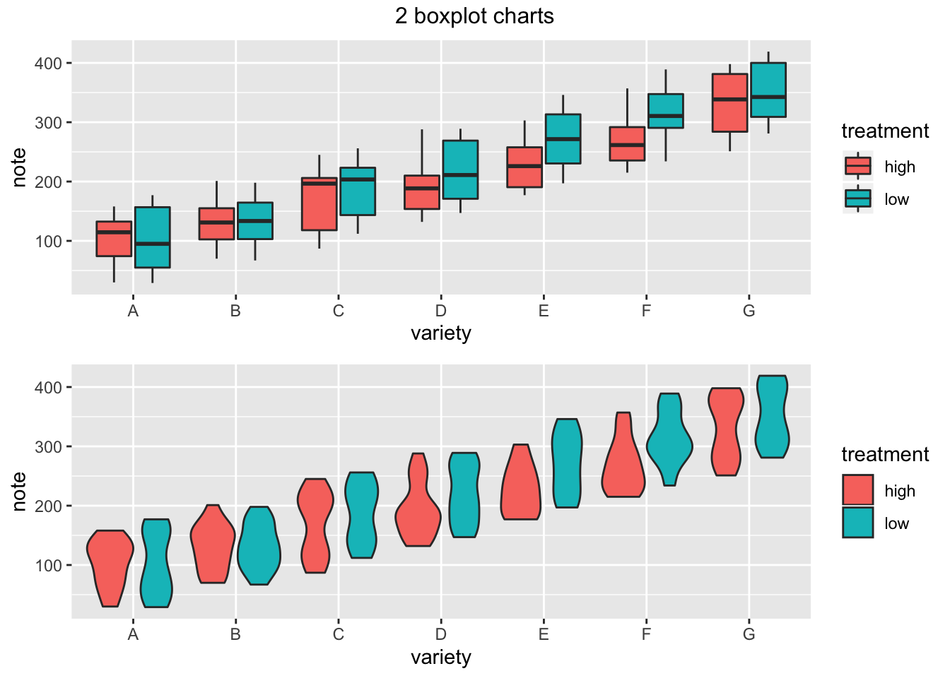
2.3 Histogram
# plot
bin <- 20
p <- ggplot(data=diamonds) +
     geom_histogram( aes(x=price),
                    #binwidth=1000, #function(x) 2 * IQR(x) / (length(x)^(1/3)),
                    bins = bin,
                    fill="#69b3a2"
                    , color="#e9ecef"
                    , alpha=0.9) +
    ggtitle(paste0("Bin size = ",bin) )

 plotly::ggplotly(p)
2.4 Barchart
- Barchart with Error Bars
# create dummy data
data <- data.frame(
  name=letters[1:5],
  value=sample(seq(4,15),5),
  sd=c(1,0.2,3,2,4)
)

# Most basic error bar
ggplot(data) +
    geom_bar( aes(x=name, y=value), stat="identity", fill="skyblue", alpha=0.7) +
    geom_errorbar( aes(x=name, ymin=value-sd, ymax=value+sd),
                   width=0.4, colour="orange", alpha=0.9, size=1.3)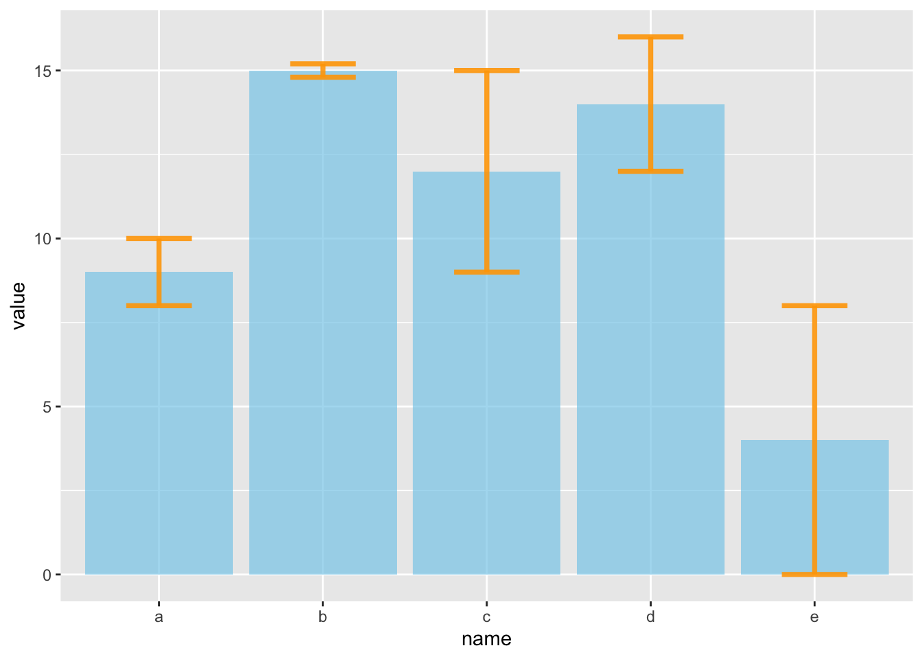
- 2 groups
#Let's build a dataset : height of 10 sorgho and poacee sample in 3 environmental conditions (A, B, C)
data <- data.frame(
  specie=c(rep("sorgho" , 10) , rep("poacee" , 10) ),
  cond_A=rnorm(20,10,4),
  cond_B=rnorm(20,8,3),
  cond_C=rnorm(20,5,4)
)

#Let's calculate the average value for each condition and each specie with the *aggregate* function
bilan <- aggregate(cbind(cond_A,cond_B,cond_C)~specie , data=data , mean)
rownames(bilan) <- bilan[,1]
bilan <- as.matrix(bilan[,-1])

#Plot boundaries
lim <- 1.2*max(bilan)

#A function to add arrows on the chart
error.bar <- function(x, y, upper, lower=upper, length=0.1,...){
  arrows(x,y+upper, x, y-lower, angle=90, code=3, length=length, ...)
}

#Then I calculate the standard deviation for each specie and condition :
stdev <- aggregate(cbind(cond_A,cond_B,cond_C)~specie , data=data , sd)
rownames(stdev) <- stdev[,1]
stdev <- as.matrix(stdev[,-1]) * 1.96 / 10

#I am ready to add the error bar on the plot using my "error bar" function !
ze_barplot <- barplot(bilan , beside=T , legend.text=T,col=c("blue" , "skyblue")
                      , ylim=c(0,lim) , ylab="height")
error.bar(ze_barplot,bilan, stdev)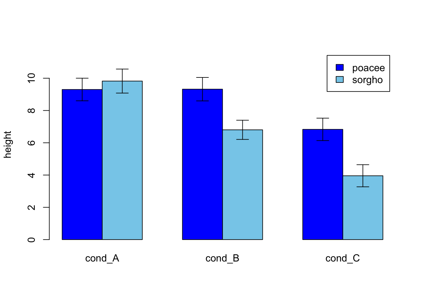
diamonds %>% filter(cut %in% c('Fair','Ideal')) %>%
  mutate(price_grp=cut(price,breaks = c(-Inf,1000,2000,3000,4000,5000,Inf))) %>%
  ggplot(aes(x=price_grp,fill=cut)) +
    geom_bar(color="#e9ecef", alpha=0.6, position = 'identity') +
    scale_fill_manual(values=c("#69b3a2", "#404080")) +
    ggtitle("Diamond price distribution")
2.5 Stack Columns
- Group barchart and Percent stacked barchar
# create a dataset
specie <- c(rep("sorgho" , 3) , rep("poacee" , 3) , rep("banana" , 3) , rep("triticum" , 3) )
condition <- rep(c("normal" , "stress" , "Nitrogen") , 4)
value <- abs(rnorm(12 , 0 , 15))
data <- data.frame(specie,condition,value)

# Grouped
p1 <- ggplot(data, aes(fill=condition, y=value, x=specie)) +
    geom_bar(position="dodge", stat="identity") +
    ggtitle("Studying 4 species..")


# Stacked + percent
p2 <- ggplot(data, aes(fill=condition, y=value, x=specie)) +
    geom_bar(position="fill", stat="identity") +
    ggtitle("Studying 4 species..")

# Graph
p3 <- ggplot(data, aes(fill=condition, y=value, x=condition)) +
    geom_bar(position="dodge", stat="identity") +
    ggtitle("Studying 4 species..") +
    facet_wrap(~specie) +
    theme(legend.position="none") +
    xlab("")


grid.arrange(p1, # First row with one plot spaning over 2 columns
             arrangeGrob(p2, p3, ncol = 2), # Second row with 2 plots in 2 different columns
nrow = 2) 
2.6 Rank
Barchart rank
p1 <- diamonds %>% dplyr::group_by(cut)  %>% tally() %>%
    ggplot( aes(x=cut, y=n)) +
    geom_bar(stat="identity", fill="#f68060", alpha=.6, width=.4) +
    #coord_flip() +
    theme_bw() +
    xlab("")

p2 <- diamonds %>% dplyr::group_by(cut)  %>% tally() %>% mutate(cut2=fct_reorder(cut,desc(n))) %>%
    ggplot( aes(x=cut2, y=n)) +
    geom_bar(stat="identity", fill="#f68060", alpha=.6, width=.4) +
    coord_flip() +
    theme_bw() +
    xlab("")

p3 <- diamonds %>% dplyr::group_by(cut)  %>% tally() %>%
  ggplot( aes(x=cut, y=n)) +
    geom_segment( aes(xend=cut, yend=0)) +
    geom_point( size=4, color="orange") +
    coord_flip() +
    theme_bw() +
    xlab("")
gridExtra::grid.arrange(p1,p2,p3,nrow=3)![]()
grid.arrange(p1, # First row with one plot spaning over 2 columns
             arrangeGrob(p2, p3, ncol = 2), # Second row with 2 plots in 2 different columns
nrow = 2) ![]()
2.7 Heatmap
# Dummy data
x <- LETTERS[1:20]
y <- paste0("var", seq(1,20))
data <- expand.grid(X=x, Y=y)
data$Z <- runif(400, 0, 5)

# Heatmap
ggplot(data, aes(X, Y, fill= Z)) +
  geom_tile()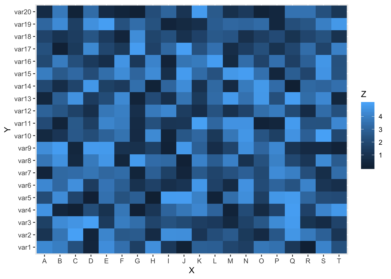
2.8 Bullet
fig <- plot_ly()
fig <- fig %>%
  add_trace(
    type = "indicator",
    mode = "number+gauge+delta",
    value = 180,
    delta = list(reference = 200),
    domain = list(x = c(0.25, 1), y = c(0.08, 0.25)),
    title =list(text = "Revenue"),
    gauge = list(
      shape = "bullet",
      axis = list(range = c(NULL, 300)),
      threshold = list(
        line= list(color = "black", width = 2),
        thickness = 0.75,
        value = 170),
      steps = list(
        list(range = c(0, 150), color = "gray"),
        list(range = c(150, 250), color = "lightgray")),
      bar = list(color = "black")))
fig <- fig %>%
  add_trace(
    type = "indicator",
    mode = "number+gauge+delta",
    value = 35,
    delta = list(reference = 200),
    domain = list(x = c(0.25, 1), y = c(0.4, 0.6)),
    title = list(text = "Profit"),
    gauge = list(
      shape = "bullet",
      axis = list(range = list(NULL, 100)),
      threshold = list(
        line = list(color = "black", width= 2),
        thickness = 0.75,
        value = 50),
      steps = list(
        list(range = c(0, 25), color = "gray"),
        list(range = c(25, 75), color = "lightgray")),
      bar = list(color = "black")))
fig <- fig %>%
  add_trace(
    type =  "indicator",
    mode = "number+gauge+delta",
    value = 220,
    delta = list(reference = 300 ),
    domain = list(x = c(0.25, 1), y = c(0.7, 0.9)),
    title = list(text = "Satisfaction"),
    gauge = list(
      shape = "bullet",
      axis = list(range = list(NULL, 300)),
      threshold = list(
        line = list(color = "black", width = 2),
        thickness = 0.75,
        value = 210),
      steps = list(
        list(range = c(0, 100), color = "gray"),
        list(range = c(100, 250), color = "lightgray")),
      bar = list(color = "black")))

fig
2.9 WaterFall (Part of Whole)
df_wf <- diamonds %>% count(cut) %>%
  mutate(prop=round(prop.table(n),digits = 2)*100) %>%
  rbind(cbind(cut='Total',as.data.frame.list(colSums(.[,-1]))))

df_wf$cut <- as.factor(df_wf$cut)

df_wf$cut <- fct_relevel(df_wf$cut,c('Total'
                        ,'Fair'
                        ,'Good'
                        ,'Ideal'
                        ,'Premium'
                        ,'Very Good'
                        ))

df_wf_plt <- df_wf %>%
  arrange(prop) %>%
  mutate(csum=cumsum(prop),
         cut = fct_reorder(cut,prop,.desc=TRUE),
         id = as.integer(cut),
         labl = paste0(scales::comma(n),' (',prop,'%)'),
         desc = case_when(id == 2 ~ "Volume Rank 2",
                          id == 3  ~ "Volume Rank 3",
                          id == 4  ~ "Volume Rank 4",
                          id == 5  ~ "Volume Rank 5",
                          TRUE ~ "cut")) %>%
  arrange(id) %>%
  mutate(end = csum - prop,
         strt = lag(end,default = 0))


 df_wf_plt %>%
  ggplot(aes(x=cut
             , xmin = id - 0.45
             , xmax = id + 0.45
             , ymin = end
             , ymax = strt
             )) +
  geom_rect(colour = "black"
            ,fill = "#FFFF66"
            ,alpha = 0.6
            , show.legend = FALSE) +
   geom_text(aes(id,end,
                   label = labl),
               vjust = 1.5,
               size = 3) +
   geom_text(aes(id,strt,
                   label = desc),
               vjust = -0.5,
               size = 3) +
   labs(title = "Waterfall Chart",
        subtitle = "By Diamonds Cut",
        caption = "(Based on data from ...)") +
   xlab("Cut Type") +
   ylab("Percentage") +
   theme_minimal()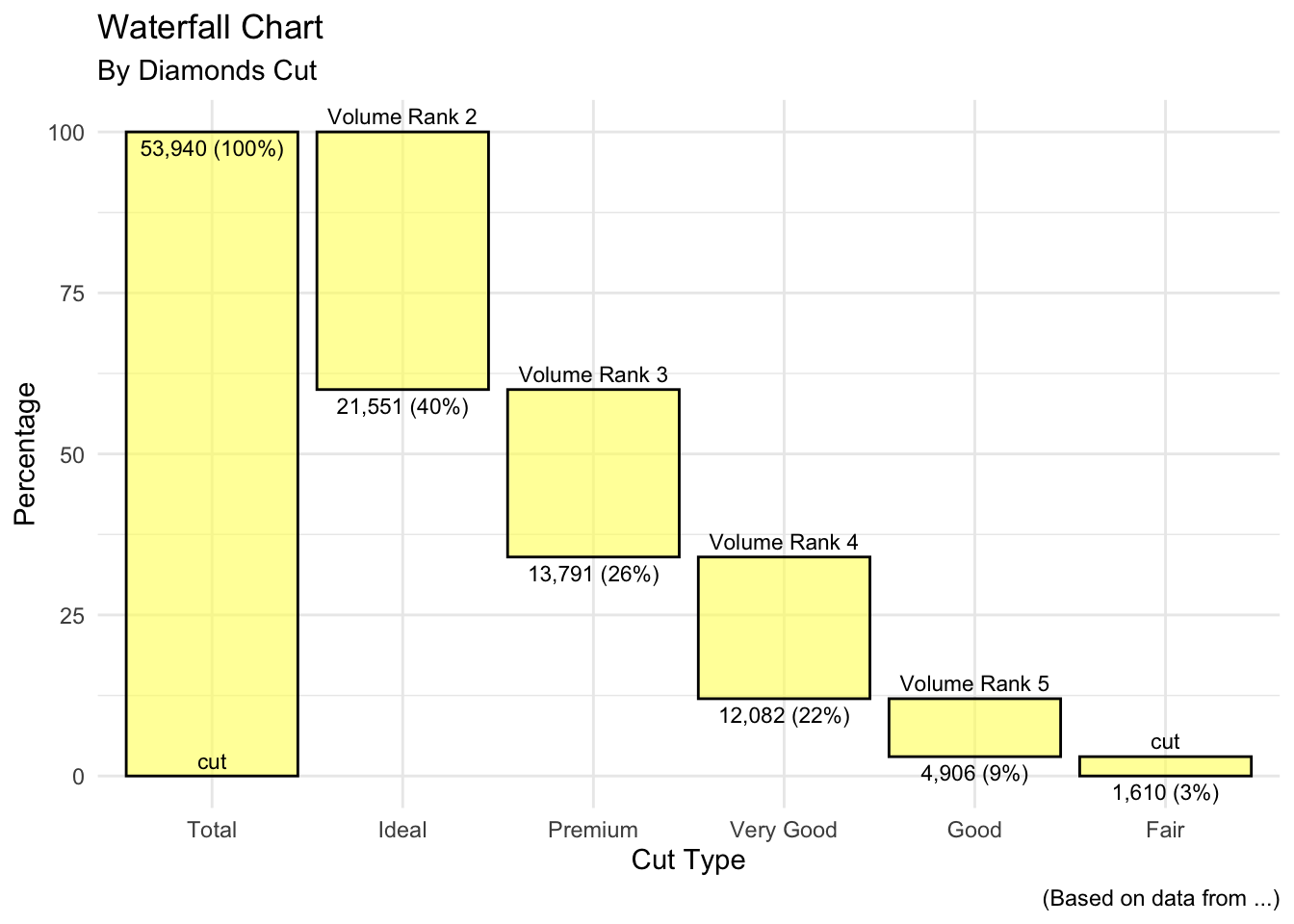
# create company income statement
category <- c("Sales", "Services", "Fixed Costs",
              "Variable Costs", "Taxes")
amount <- c(101000, 52000, -23000, -15000, -10000)
income <- data.frame(category, amount)

waterfalls::waterfall(income,
          calc_total=TRUE,
          total_axis_text = "Net",
          total_rect_text_color="black",
          total_rect_color="goldenrod1") +
  scale_y_continuous(label=scales::dollar) +
  labs(title = "West Coast Profit and Loss",
       subtitle = "Year 2017",
       y="",
       x="") +
theme_minimal() 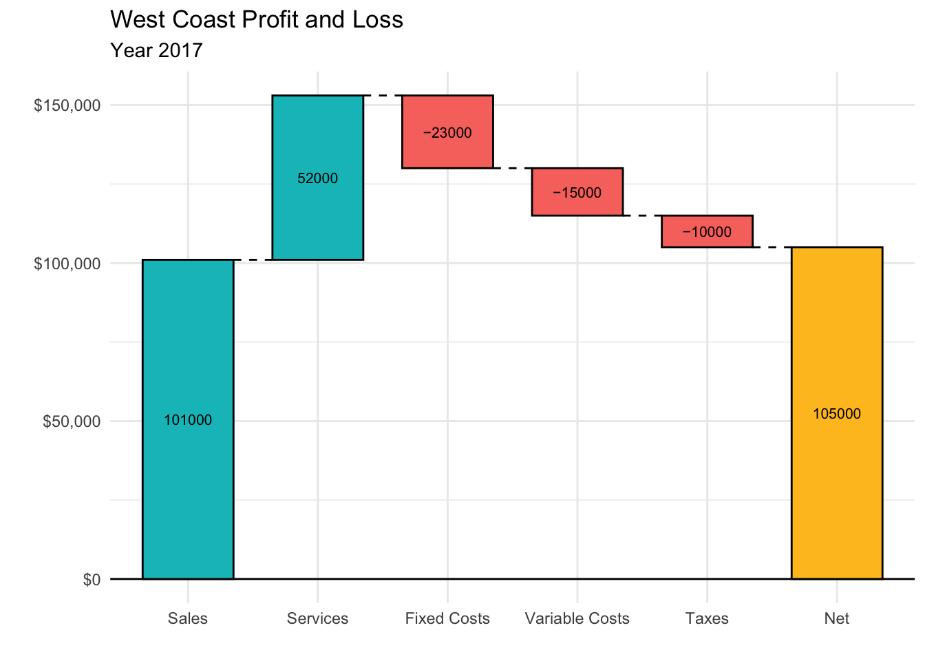
balance <- data.frame(desc = c("Starting Cash",
     "Sales", "Refunds", "Payouts", "Court Losses",
     "Court Wins", "Contracts", "End Cash"),
     amount = c(2000,
     3400, -1100, -100, -6600, 3800, 1400, 2800))
balance$desc <- factor(balance$desc, levels = balance$desc)
balance$id <- seq_along(balance$amount)
balance$type <- ifelse(balance$amount > 0, "in","out")
balance[balance$desc %in% c("Starting Cash", "End Cash"),"type"] <- "net"

balance$end <- cumsum(balance$amount)
balance$end <- c(head(balance$end, -1), 0)
balance$start <- c(0, head(balance$end, -1))
balance <- balance[, c(3, 1, 4, 6, 5, 2)]

# id          desc type start   end amount
# 1  1 Starting Cash  net     0  2000   2000
# 2  2         Sales   in  2000  5400   3400
# 3  3       Refunds  out  5400  4300  -1100
# 4  4       Payouts  out  4300  4200   -100
# 5  5  Court Losses  out  4200 -2400  -6600
# 6  6    Court Wins   in -2400  1400   3800
# 7  7     Contracts   in  1400  2800   1400
# 8  8      End Cash  net  2800     0   2800


# ggplot(balance, aes(desc, fill = type)) +
#   geom_rect(aes(x = desc,xmin = id - 0.45, xmax = id + 0.45, ymin = end,
#      ymax = start))
# balance$type <- factor(balance$type, levels = c("out","in", "net"))

strwr <- function(str) gsub(" ", "\n", str)

p1 <- ggplot(balance, aes(fill = type)) +
  geom_rect(aes(x = desc,
                xmin = id - 0.45,
                xmax = id + 0.45,
                ymin = end,
                ymax = start)) +
  scale_y_continuous("", labels = scales::comma) +
     scale_x_discrete("", breaks = levels(balance$desc),
         labels = strwr(levels(balance$desc))) +
     theme(legend.position = "none")

p1 + geom_text(data = balance[balance$type == "in",],
               aes(id,end,
                   label = scales::comma(amount)),
               vjust = 1,
               size = 3) +
     geom_text(data = balance[balance$type == "out",], aes(id,
         end, label = scales::comma(amount)), vjust = -0.3,
         size = 3) +
  geom_text(data = subset(balance,
     type == "net" & id == min(id)), aes(id, end,
     colour = type, label = scales::comma(end), vjust = ifelse(end <
         start, 1, -0.3)), size = 3.5) +
  geom_text(data = subset(balance,
     type == "net" & id == max(id)), aes(id, start,
     colour = type, label = scales::comma(start), vjust = ifelse(end <
         start, -0.3, 1)), size = 3.5)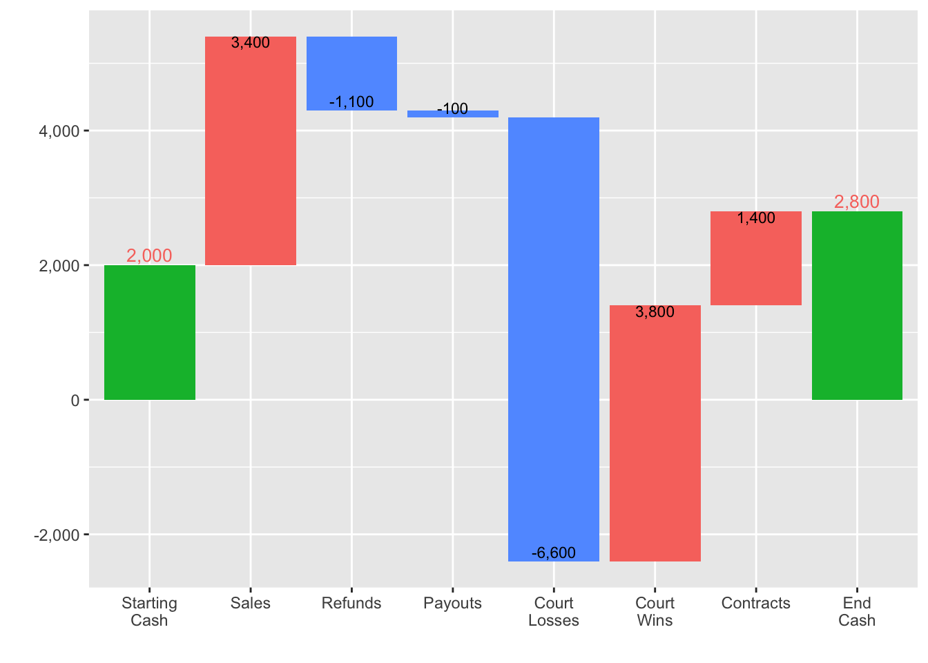
3. Relationship
3.1 Scatter
# A basic scatterplot with color depending on Species
p1 <- ggplot(iris, aes(x=Sepal.Length, y=Sepal.Width, color=Species)) +
    geom_point(size=3)

p2 <- ggplot(iris, aes(x=Sepal.Length, y=Sepal.Width)) +
  geom_point() +
  geom_smooth(method=lm , color="red", fill="#69b3a2", se=TRUE)

gridExtra::grid.arrange(p1,p2,nrow=2)
3.2 Correlation
# Quick display of two cabapilities of GGally, to assess the distribution and correlation of variables
library(GGally)

# Create data
data(flea)
ggpairs(flea, columns = 2:4, ggplot2::aes(colour=species)) 
3.3 Combined Bar and line
# Build dummy data
data <- data.frame(
  day = as.Date("2019-01-01") + 0:99,
  temperature = runif(100) + seq(1,100)^2.5 / 10000,
  price = runif(100) + seq(100,1)^1.5 / 10
)

# Value used to transform the data
coeff <- 10

# A few constants
temperatureColor <- "#69b3a2"
priceColor <- rgb(0.2, 0.6, 0.9, 1)

ggplot(head(data, 80), aes(x=day)) +

  geom_bar( aes(y=temperature), stat="identity", size=.1, fill=temperatureColor, color="black", alpha=.4) +
  geom_line( aes(y=price / coeff), size=2, color=priceColor) +

  scale_y_continuous(

    # Features of the first axis
    name = "Temperature (Celsius °)",

    # Add a second axis and specify its features
    sec.axis = sec_axis(~.*coeff, name="Price ($)")
  ) +

  theme(
    axis.title.y = element_text(color = temperatureColor, size=13),
    axis.title.y.right = element_text(color = priceColor, size=13)
  ) +

  ggtitle("Temperature down, price up")
3.6 Evolution (Change over time)
# Load dataset from github
data <- read.table("https://raw.githubusercontent.com/holtzy/data_to_viz/master/Example_dataset/3_TwoNumOrdered.csv", header=T)
data$date <- as.Date(data$date)

# plot
data %>%
  ggplot( aes(x=date, y=value)) +
    geom_line(color="#69b3a2") +
    ylim(0,22000) +
    annotate(geom="text", x=as.Date("2017-01-01"), y=20089,
             label="Bitcoin price reached 20k $\nat the end of 2017") +
    annotate(geom="point", x=as.Date("2017-12-17"), y=20089,
             size=10, shape=21, fill="transparent") +
    geom_hline(yintercept=5000, color="orange", size=.5)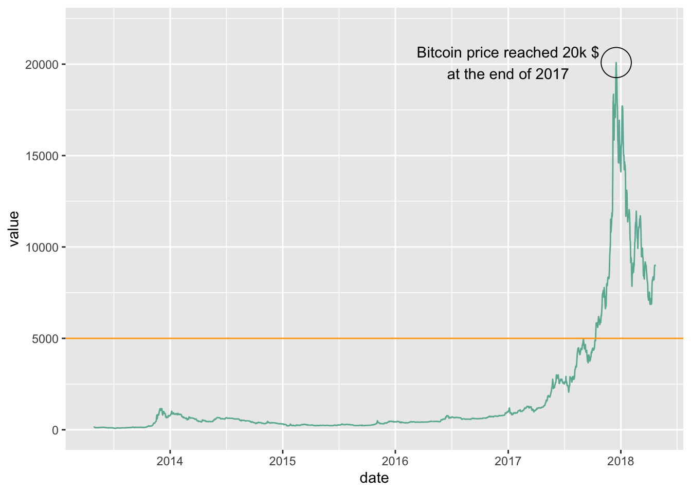
library(dygraphs)
library(xts)          # To make the convertion data-frame / xts format

# Create data
data <- data.frame(
  time=seq(from=Sys.Date()-40, to=Sys.Date(), by=1 ),
  value=runif(41)
)

# Double check time is at the date format
str(data$time)
## Date[1:41], format: "2020-04-18" "2020-04-19" "2020-04-20" "2020-04-21" "2020-04-22" ...# Switch to XTS format
data <- xts(x = data$value, order.by = data$time)
# Default = line plot --> See chart #316
# Add points
p1 <- dygraph(data) %>%
dyOptions( drawPoints = TRUE, pointSize = 4 )
p1p2 <- dygraph(data) %>%
dyOptions( fillGraph=TRUE )trend <- sin(seq(1,41))+runif(41)
data <- data.frame(
time=seq(from=Sys.Date()-40, to=Sys.Date(), by=1 ),
trend=trend,
max=trend+abs(rnorm(41)),
min=trend-abs(rnorm(41, sd=1))
)
# switch to xts format
data <- xts(x = data[,-1], order.by = data$time)
# Plot
p3 <- dygraph(data) %>%
dySeries(c("min", "trend", "max"))
p3df <- economics %>%
select(date, psavert, uempmed) %>%
gather(key = "variable", value = "value", -date)
# Multiple line plot
p1 <- ggplot(df, aes(x = date, y = value)) +
geom_line(aes(color = variable), size = 1) +
scale_color_manual(values = c("#00AFBB", "#E7B800")) +
theme_minimal()
# Area plot
p2 <- ggplot(df, aes(x = date, y = value)) +
geom_area(aes(color = variable, fill = variable),
alpha = 0.5, position = position_dodge(0.8)) +
scale_color_manual(values = c("#00AFBB", "#E7B800")) +
scale_fill_manual(values = c("#00AFBB", "#E7B800")) +
theme_minimal()
gridExtra::grid.arrange(p1,p2,nrow=2)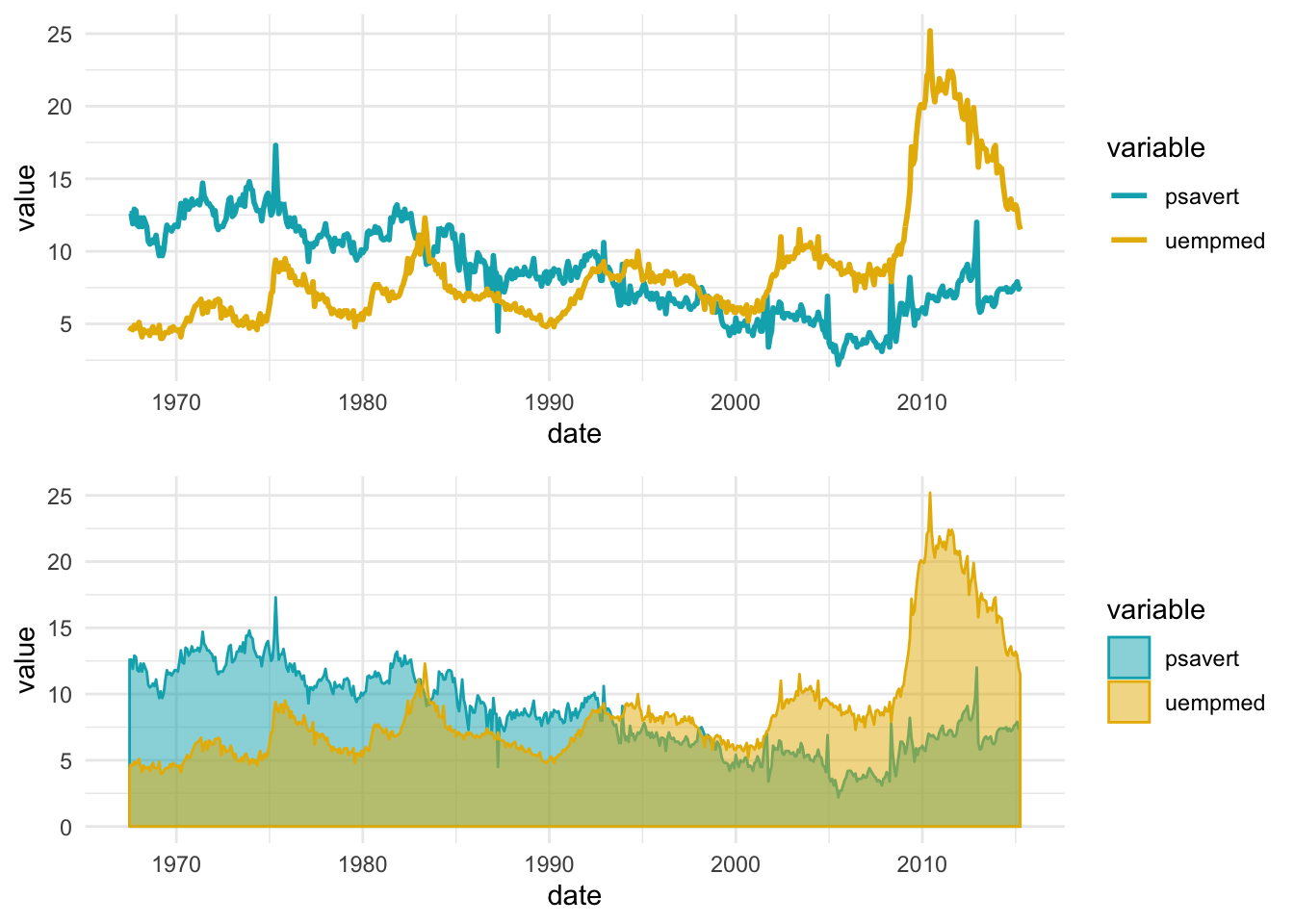
3.7 Calendar-Heatmap
library(lubridate) # for easy date manipulation

amznStock = as.data.frame(tidyquant::tq_get(c("AMZN"),get="stock.prices")) # get data using tidyquant
amznStock = amznStock[year(amznStock$date) > 2017, ] # Using data only after 2012

amznStock$weekday = as.POSIXlt(amznStock$date)$wday #finding the day no. of the week
amznStock$weekdayf<-factor(amznStock$weekday,levels=rev(1:7),labels=rev(c("Mon","Tue","Wed","Thu","Fri","Sat","Sun")),ordered=TRUE) # converting the day no. to factor

amznStock$monthf<-factor(month(amznStock$date),levels=as.character(1:12),labels=c("Jan","Feb","Mar","Apr","May","Jun","Jul","Aug","Sep","Oct","Nov","Dec"),ordered=TRUE) # finding the month

amznStock$week <- as.numeric(format(amznStock$date,"%W")) # finding the week of the year for each date

amznStock$day <- lubridate::day(amznStock$date)

p <- ggplot(amznStock, aes(monthf, day, fill = amznStock$adjusted)) +
    geom_tile(colour = "white") + facet_grid(year(amznStock$date)~ .) + scale_fill_gradient(low="red", high="green") +  xlab("Month") + ylab("") + ggtitle("Time-Series Calendar Heatmap: AMZN Stock Prices") + labs(fill = "Price")

p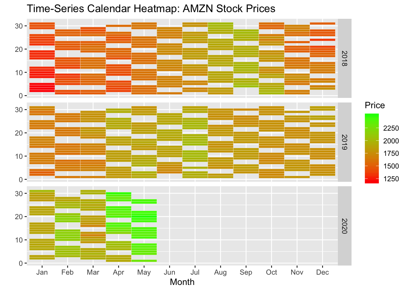
stock.data <- transform(amznStock,
  week = as.POSIXlt(amznStock$date)$yday %/% 7 + 1,
  wday = as.POSIXlt(amznStock$date)$wday,
  year = as.POSIXlt(amznStock$date)$year + 1900)

library(ggplot2)

ggplot(stock.data, aes(week, wday, fill = adjusted)) +

  geom_tile(colour = "white") +

  scale_fill_gradientn(colours = c("#D61818","#FFAE63","#FFFFBD","#B5E384")) +

  facet_wrap(~ year, ncol = 1)
4 Spatial
4.1 Map
# Load the library

# Note: if you do not already installed it, install it with:
# install.packages("leaflet")

# Background 1: NASA
# m <- leaflet() %>%
#    addTiles() %>%
#    setView( lng = 2.34, lat = 48.85, zoom = 5 ) %>%
#    addProviderTiles("NASAGIBS.ViirsEarthAtNight2012")
# m

# Background 2: World Imagery
m <- leaflet() %>%
   addTiles() %>%
   setView( lng = 2.34, lat = 48.85, zoom = 3 ) %>%
   addProviderTiles("Esri.WorldImagery")
m
data("world.cities")
df <- world.cities %>% filter(country.etc=="Australia")
## define a palette for hte colour
pal <- colorNumeric(palette = "YlOrRd",
domain = df$pop)
leaflet(data = df) %>%
addTiles() %>%
addCircleMarkers(lat = ~lat, lng = ~long, popup = ~name,
color = ~pal(pop), stroke = FALSE, fillOpacity = 0.6) %>%
addLegend(position = "bottomleft", pal = pal, values = ~pop)leaflet(data = df) %>%
addTiles() %>%
addMarkers(lat = ~lat, lng = ~long, popup = ~name,
label=~ as.character(pop),clusterOptions =
markerOptions()) %>%
addLegend(position = "bottomleft", pal = pal, values = ~pop)- To be continued